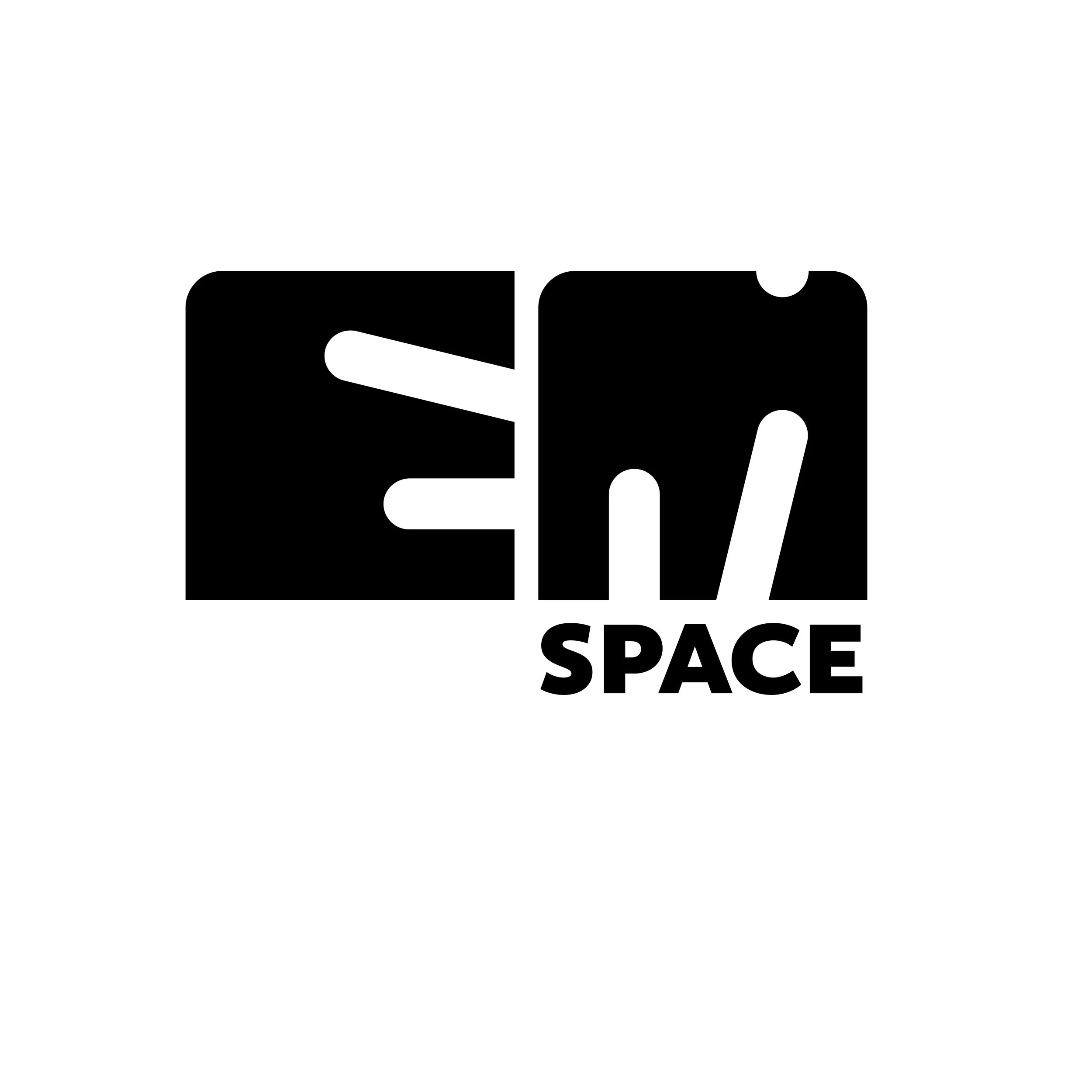
Em Space Logo
This logo was created for the CCSF’s Visual Media Design Department’s Gallery. For this design, I wanted to blend both creative and technical ideas. Since the name is Em Space, I began with two squares as the foundation. To express creativity, I carved the ‘E’ and ‘M’ out of these forms using diagonal lines of varying angles and lengths. To ensure a feeling of cohesion, I used the same diagonal lines on both letters. I also added a small ‘nick’ at the top of the ‘M’ as a nod to the notches found in traditional lead letterpress type and spacing material.
Overall, my goal was to create a mark that feels bold and visually striking. For the accompanying type, I chose a humanist sans-serif font, Calluna Sans—something that complements the mark’s strength while still offering subtle variation in the letterforms and a slightly warmer feel.